Spring colours
Colour experts pantone have launched their colour collection for Spring 2017 and it is a blend of soft pastel tones that create a sense of 'vitality, relaxation and the great outdoors'.
If colour interests you, and it certainly does every one here at Cheynes, the information contained in this post, sourced directly from Pantone.com will prove of invaluable use to you this coming season.
Our teams will use this information to help them understand what colour swill be the dominant factor for spring and into summer and whilst we don't see everyone walking around with yellow or green hair (greenery is 2017's major colour) we can take the inspiration and the 'flavour' of the colours to make then fit your hair style.
Laurie Pressman is the Vice-President of the Pantone Color Institute and has 20 years experience in the world of color and trend. She loves traveling the world looking for what is new and next and sees color as the story of life.
2017 sees the following shades being the most influential across fashion and style.
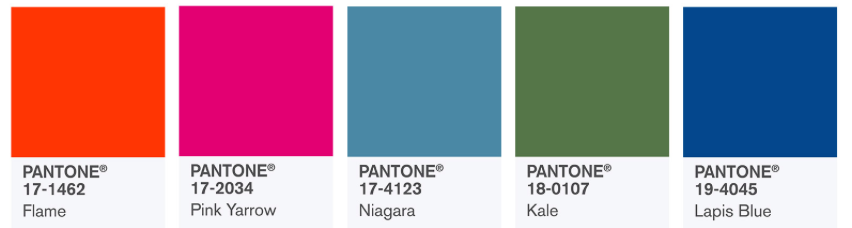
PANTONE 17-4123 Niagara
Comfortable and dependable, Niagara leads the PANTONE Fashion Color Report as the most prevalent color for spring 2017. Niagara is a classic denim-like blue that speaks to our desire for ease and relaxation.
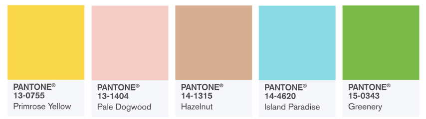
PANTONE 13-0755 Primrose Yellow
By contrast, Primrose Yellow sparkles with heat and vitality. Inviting us into its instant warmth, this joyful yellow shade takes us to a destination marked by enthusiasm, good cheer and sunny days.
PANTONE 19-4045 Lapis Blue
Conveying even more energy is Lapis Blue. Strong and confident, this intense blue shade is imbued with an inner radiance.
PANTONE 17-1462 Flame
A red-based orange, Flame, is gregarious and fun loving. Flamboyant and vivacious, this wonderfully theatrical shade adds fiery heat to the spring 2017 palette.
PANTONE 14-4620 Island Paradise
Island Paradise is a refreshing aqua that calls to mind a change of scenery. A cool blue green shade that speaks to our dream of the great escape, Island Paradise is emblematic of tropical settings and our desire to unwind.
PANTONE 13-1404 Pale Dogwood
Continuing the tranquil mood, Pale Dogwood is a quiet and peaceful pink shade that engenders an aura of innocence and purity. The unobtrusive Pale Dogwood is a subtle pink whose soft touch infuses a healthy glow.
PANTONE 15-0343 Greenery
Bringing forth a refreshing take, Greenery is a tangy yellow-green that speaks to our need to explore, experiment and reinvent. Illustrative of flourishing foliage, the fertile attributes of Greenery signals one to take a deep breath, oxygenate and reinvigorate.
PANTONE 17-2034 Pink Yarrow
Tropical and festive, Pink Yarrow is a whimsical, unignorable hue that tempts and tantalizes. Bold, attention getting and tempestuous, the lively Pink Yarrow is a captivating and stimulating color that lifts spirits and gets the adrenaline going.
PANTONE 18-0107 Kale
Evocative of the great outdoors and a healthy lifestyle, Kale is another foliage-based green that conjures up our desire to connect to nature, similar to the more vivacious Greenery. And, just as we see in nature, this lush and fertile natural green shade provides the perfect complementary background to the more vibrant tones in the palette.
PANTONE 14-1315 Hazelnut
Rounding out the spring 2017 colors is Hazelnut, a key neutral for spring. This shade brings to mind a natural earthiness. Unpretentious and with an inherent warmth, Hazelnut is a transitional color that effortlessly connects the seasons.
Pantone really is the ultimate authority on global colour trends and we will watch with interest how these colours here find themselves into our every day life.