Shades of nature (A/W17)
Pantone, the colour authority has recently launched an interesting article linked to London and New York fashion weeks for A/W17.
Following on from the colour of the year (greenery) which suggested a hark back to nature, the colours that will dominate all aspects of fashion as we enter into Autumn will be interesting in as much as they are unusual and offer contrasting shade combinations for fabrics and (for us) hair.
Here's the official line .... with thanks to Pantone.
Color Palette for London A/W17: Leatrice Eiseman, Executive Director of the Pantone Color Institute says:
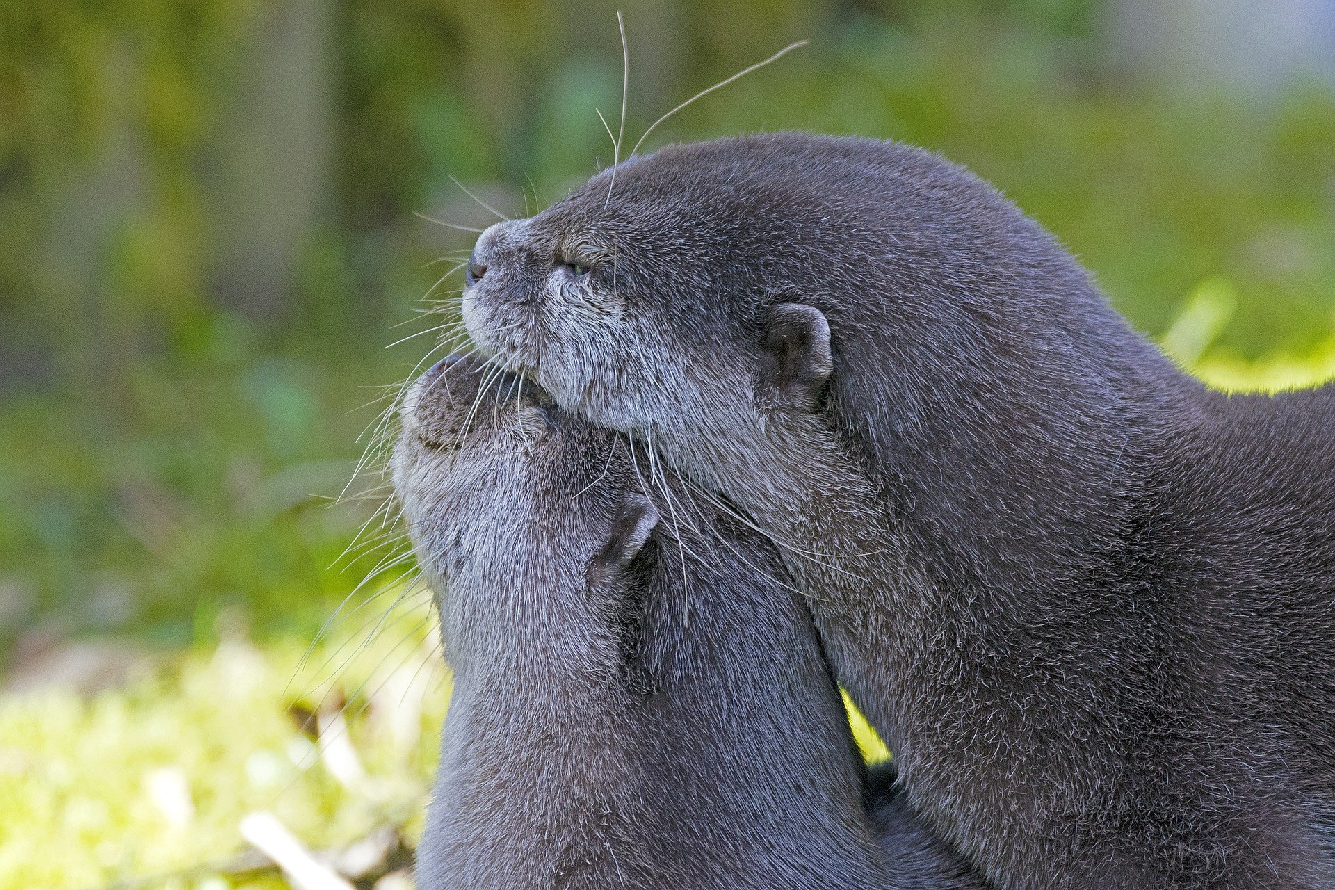
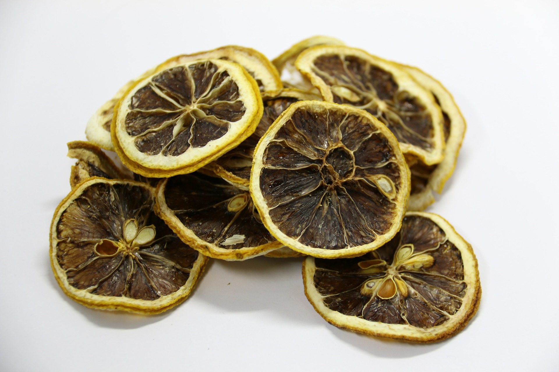
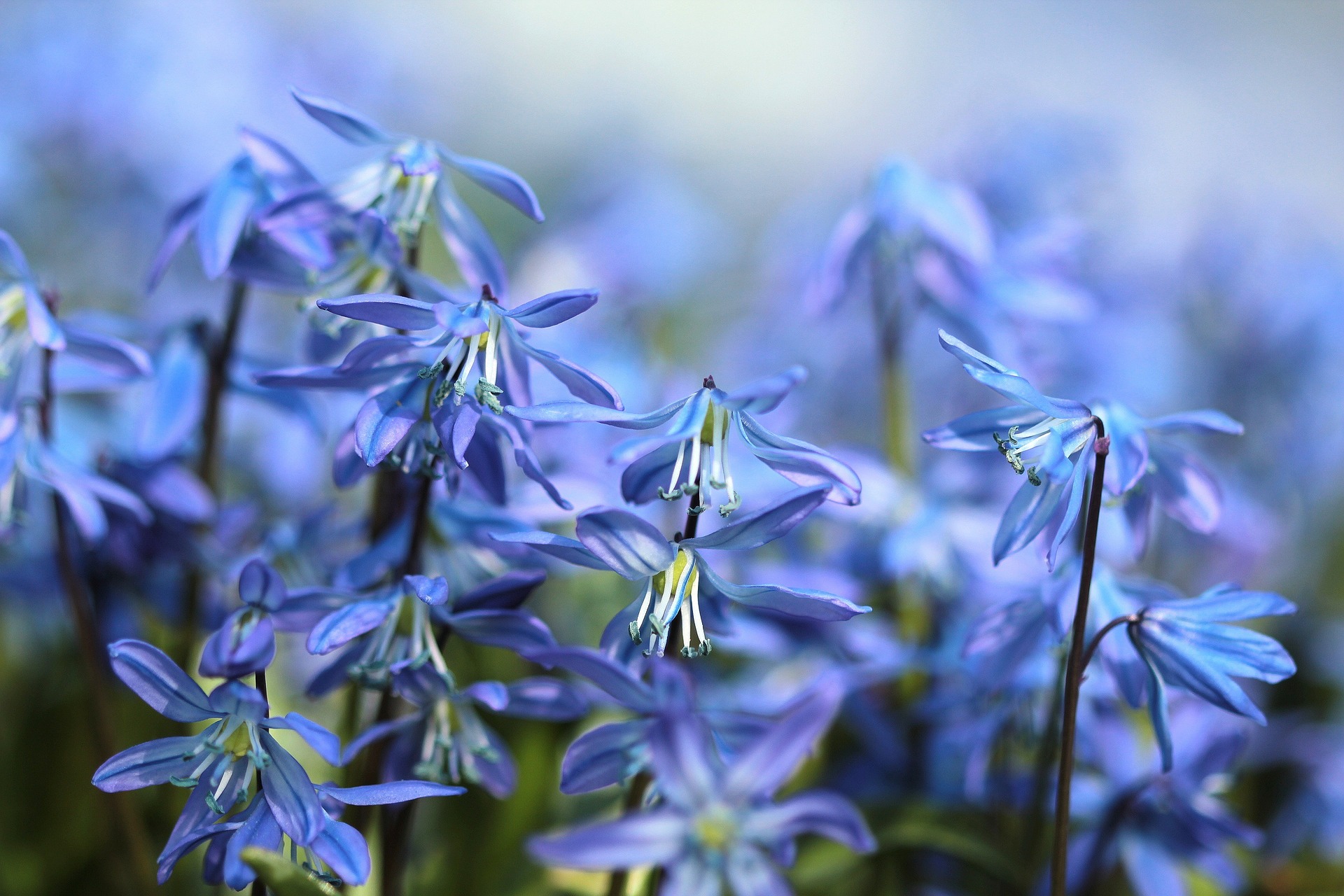
“Led by a vivid Flame Scarlet, the color palette for Fall 2017 is comprised of strong classics colors complemented by a few unpredictable shades for the autumn and winter seasons,” noted Eiseman. “Unexpected combinations such as Royal Lilac and Otter Brown or Lemon Curry with Bluebell are eye-arresting and create an unusual color dichotomy.”

Discover the article in full here, https://www.pantone.com/pages/MYP_mypantone/mypInfo.aspx?ca=75&pg=21306
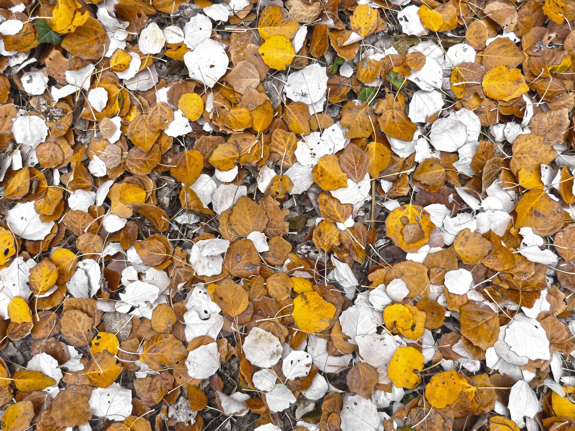
In summary we can expect to see powerful reds as the lead colour for A/W with softer pink tones, toast (it even sounds like an autumn colour), Bluebell to offer a sense of peace, royal lilac, a theatrical purple tone, otter, a colour that bring the country into the city, Navy peony, this coming seasons alternative to black. Copper tan, a red-brown perfect for autumn; lemon curry a spicy tone and golden olive offer unusual shades to create added interest to the palette of shades for A/W.
It might seem odd to be talking about Autumn and Winter shades just as Summer is starting but that's the world of fashion.... it's a must have to know what is coming along so that we can think about what hair colours might be influenced by the upcoming trend predictions.
For example: otter is not a colour we would naturally link to hair colour, but the colour can be adapted to create a stunning pastel shade that makes blonde hair look on trend and expensive and can be used to fashion a fabulous shiny brown.
Here at Cheynes we are passionate about colour and our colour experts can create the perfect shade for your hair.
Until A/W17 actually happens, enjoy your summer colour, and when the time os right to start thinking about a change, we are ready to design your own, unique Cheynes colour.
PANTONE®, a wholly owned subsidiary of X-Rite, Incorporated, is the global color authority and provider of professional color standards for the design industries. Today Pantone's universal language of color is used by 100 million design professionals worldwide to access color trends, communicate color choices and control consistency of color across every imaginable surface, texture, material and finish.
Through The Pantone Color Institute, Pantone continues to forecast future color direction and study how color influences human thought processes, emotions and physical reactions. Pantone furthers its commitment to providing professionals with a greater understanding of color and to help them utilize color more effectively. Always a source for color inspiration, Pantone also offers designer-inspired products and services for consumers.